ASLE (The Association for the Study of Literature and Environment) is a scholarly organization connecting literature, culture, and the environment. Its website serves as a hub for resources, events, and a global academic network. This case study takes a user-centered approach to assess how well the site meets diverse audience needs and explores ways to improve accessibility, clarity, and usability in line with ASLE’s mission.
Introduction

Understanding the problem
ASLE serves a diverse academic and creative community, but its website doesn’t always meet users’ varying needs. Visitors seeking resources like jobs, grants, or teaching materials often struggle with a structure shaped by internal logic rather than user goals, leading to poor discoverability and a less intuitive experience.
This case study examines how ASLE’s current information architecture affects access and explores how a more user-centered, role-based design could improve clarity, engagement, and usability.
Challenges in finding resources due to overwhelming navigation and fragmented structure
Before conducting research, we formed a set of early assumptions about potential issues in ASLE’s Resources section. These helped highlight areas where usability might be falling short:
The navigation structure may reflect internal organization more than user goals.
IA reflects internal logic
Our Assumptions
Key resources like job listings, grants, and teaching materials may be spread across multiple categories, making them hard to find.
Resources are hard to find
Grouping may be unclear
A lack of clear grouping may leave users unsure where to begin their search.
Not all users may be supported
Users may have specific goals but struggle to identify clear starting points due to unclear grouping.
Labels such as “Explore Our Field” or “Research & Write” may be too broad or unclear for task-oriented users.
Labels may be unclear
Where we started, observations turned assumptions

With these patterns and questions in mind, we conducted user interviews to validate assumptions and uncover deeper needs. Interviewing ASLE users revealed that their pain points are aligned with our findings from the desk research.
”Teach has useful materials, but finding pedagogy workshops and publications requires searching multiple sections.”
“Educator content appears in sections like ‘Member Bookshelf’ or ‘Research & Write,’ making the site feel fragmented.”
“I searched for grants and postdocs, but the confusing navigation forced me to get help. The site offers no guidance.”
“I wanted student-focused resources but had to dig through unrelated sections, so I usually just rely on the search bar.”
“I visit the site for research funding or grants, but the categories don’t match how I think, so I just use the search bar.”
“Even after years on ASLE, I still have to hunt for resources and grants; it’s never intuitive.”
What Users Think About ASLE

Students
Researchers
Educators


User Research


Key Insights
🥅 Goal-Driven Behavior
Users come with clear tasks (grants, postdocs), not to browse vague categories.
⚠️ Confusing Labels
Terms like “Explore Our Field” lead to confusion and misclicks.
🧩 Scattered Resources
Key materials are spread across unrelated sections.
👥 Missing Role-Based Paths
No clear entry points for students, educators, or researchers.
🔍 Workarounds & Search Struggles
Users rely on trial, error, and the search bar to navigate gaps, but search results are often incomplete.

Who are the people behind the search for grants, teaching tools, and academic opportunities?
Defining Personas
Researcher Persona
Student Persona
Educator Persona



Early-career ecocritical researcher (postdoc level)
Goal: Access research grants, jobs, links to funding opportunities, and other resources to support publications and proposals
Frustration: CFPs are clearly located under “Conferences,” but research grants, jobs, and related materials are scattered across “Join Our Community,” “Research & Write,” and external links, without a centralized place for research support
JTBD: When I’m preparing a proposal or planning my next project, I want to quickly locate research funding and related tools without guessing which category they’re buried under.
Undergraduate student in environmental literature
Goal: Explore opportunities and resources offered by ASLE that can support her academic growth and future studies
Frustration: The student section splits into undergrad and grad paths, but only the graduate page offers clear structure. Key subcategories also appear on the grad page, creating confusion about what’s meant for undergraduates.
JTBD: When I visit the ASLE website, I want to easily understand which resources are for undergrads like me, so I know where to focus and what I can access.
Environmental humanities professor
Goal: Access teaching materials and educator-facing opportunities (e.g., pedagogy-focused CFPs or workshops)
Frustration: While teaching materials are available under “Teach,” related content is scattered across unrelated sections like “Member Bookshelf” and “Research & Write,” making it hard to form a clear task flow
JTBD: When preparing for a new course or seeking professional development, I want to find teaching tools and pedagogy-related resources without needing to explore unrelated parts of the site.
To better understand the experience of our personas on ASLE, we defined the user journey map that highlights key pain points and areas for improvement.
Current Journey
Pain Point
Unclear what kind of content is offered before entering the Student section
Content is minimal, lacks structure or next steps
Feels overlooked — undergrad section seems like an afterthought
Content appears general or targeted to researchers and educators
No clear academic entry point for early-stage students
Student Tab
Action
Undergrad View
Graduate Page
External Links
Selects "Student" from the menu to start browsing
Checks undergrad-specific page for support or opportunities
Clicks to graduate page and sees richer content and clearer layout
Tries other areas (Explore Our Field, Resources) for undergrad-relevant content
Stops exploring due to lack of relevant next steps
Drops Off
User Journey Map: Undergraduate Student
A student visits ASLE hoping to explore academic opportunities and find resources that align with her level and interests.


Emotion
Opportunity
Opportunity


Curious, hopeful, but slightly uncertain
Underwhelmed
Overlooked & unmotivated
Disconnected

Insight: The clearest opportunity arises between Steps 3 and 4, where the user’s motivation drops significantly, making it the ideal point for strategic intervention.
Pain Point
No clear entry point for research needs
Missing contextual resources for submissions
Content is scattered and hard to locate
No filtering or support for navigation
Lacks ecosystem and academic workflow
Homepage Visit
Action
CFP Discovery
Seeks Funding
External Links
Arrives at ASLE hoping to find research support
Finds calls for papers under Conferences
Browses Research & Write, Join Our Community
Clicks to job board & grant links
Quits search and exits ASLE platform
Leaves Site
Insight: The clearest opportunity arises between Steps 3 and 4, when the structural gap becomes emotionally impactful, offering a timely moment for redesign intervention.
User Journey Map: Early-Career Scholar
Preparing a research proposal and seeking related support (funding, CFPs, job listings)


Hopeful
Confused, Frustrated
Overwhelmed
Disappointed
Slight Relief
Emotion
Opportunity
Opportunity


Each persona’s experience was visualized based on their journey type: emotional journey maps for discovery-based users (scholar, student), and a task flow diagram for the educator to reflect functional breakdowns in teaching workflows.
Pain Point
Turns to outside
tools after an inefficient search.
Pain Point
No way to filter for educator-specific sessions.
Pain Point
Scattered content geared toward researchers.
Pain Point
Labels unclear; no filters by purpose or level.
Pain Point
Few resources; lacks broad teaching support.
Task Flow: Educator Accessing Teaching Resources
How an environmental humanities educator attempts to locate teaching materials and professional resources across ASLE’s platform.

Visit “Teach” Page for Course Tools
Check “Bookshelf” for Teaching Materials
Explore “Research
& Write” for CFPs
Browse “Conferences” for PD Events
Leaves Platform Unfulfilled
Insight: Bring scattered teaching tools together into a centralized Educator Hub.
How are these groups interacting with ASLE?
HMW: Turning Pain Points into Possibilities


How might we help students find content that matches their academic level without confusion?
How might we help scholars access research tools without navigating scattered sections?
How might we unify CFPs, grants, and publishing resources in one place?
How might we make teaching, research, and learning resources easier to discover?
Reimagining the ASLE experience through the lens of real user struggles.
How might we support these personas in confidently finding and using the resources they need?
Gaps, Gains, and Growth
Role-Based Filtering & Task-Oriented Labels
What it does well
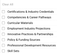
Uses filters and categories that reflect user intent (e.g., role, topic, content type)
Applies clear, task-oriented labels like “Curriculum” and “Campus Engagement”
Centralizes resources (toolkits, case studies, grants) in one place
Minimizes effort through a clean, structured layout
Takeaway for ASLE
Introduce role-aware pathways and task-based labels.
A filterable resource hub can help users navigate without guesswork.
Association for the Advancement of Sustainability in Higher Education (AASHE)


Content Filters
Format-Based Subcategories for Academic Engagement
What it does well
Structures content by format and user type (e.g., graduate tools, video archive, toolkits)
Breaks toolkits into purpose-based subcategories for practical use
Provides downloadable resources that support public-facing scholarship
Encourages task-based exploration through clearly labeled sections
Takeaway for ASLE
Use format-based categories to support academic workflows.
Clearly labeled sections like Toolkits, Student Resources, and CFP Archives can help users quickly find content by task or type.


Public Humanities Hub - The University of British Columbia
Insights from Competitive Research
Competitive research revealed four key UX directions to strengthen ASLE’s resource hub:
Lack of structured access
→ Modular sections within a centralized resource hub improve clarity and usability.
Limited discoverability
→ Filters and task-based labels enable users to quickly locate relevant content.
Unclear content formats
→ Grouping resources by type (e.g., toolkits, syllabi, videos) supports academic workflows.
Overwhelming layouts
→ Thematic hubs and exploratory tools (e.g., timelines, maps) create a more intuitive experience.
We analyzed how peer platforms structure resources, support varied users, and what usability patterns shape their navigation and experience.
ASLE provides rich content and a strong sense of community, but falls short in helping users navigate resources aligned with their needs.

Curated Exploration with Thematic Hubs
What it does well
Groups content into role-neutral hubs organized by theme, topic, and format
Uses exploratory tools like timelines, keyword maps, and location-based filters
Enhances clarity through structured content architecture
Creates immersive experiences through visually curated, narrative-driven pages
Takeaway for ASLE
Group resources into clear, goal-driven hubs.
Prioritize navigation based on user logic, not internal structure, to support intuitive exploration.
Environment & Society Portal – Rachel Carson Center

Sustainability Education and Economic Development Center (SEED)


Subject-specific curriculum access
Practical, topic-focused guidance
Sector–topic structured access
Modular Curriculum, Practical Toolkits & Topic-Based Resource Matrix
What it does well
Offers modular curriculum by subject
Provides practical toolkits for institutional and classroom use
Uses a sector–topic matrix for broad rtesource discovery
Balanes clarity, structure, and reusability
Takeaway for ASLE
Adopt a layered resource system modeled after SEED to improve clarity and access.
Organize content through:
Curriculum Modules → Subject-based, modular content
Toolkits → Practical guides for course and program development
Resource Center → Topic-based access to reports, CFPs, and teaching tools
To prioritize ideas, we mapped HMW questions by user needs and business impact, highlighting solutions that balance user value with ASLE’s goals.
Prioritization Matrix
User Need
Business Impact

Personalized dashboards
Interactive CFP timeline
Saved Resource Collections
Social forum
Anchor links on landing pages
Simple UI adjustments
Separate microsites
AI-driven personalization
Primary Focus
Long-Term Value
Low Priority
Further Potential
Centralized Research Hub
Role-based filters and tags
Clarify navigation labels
Modular teaching/research hubs
Undergrad/advanced content labels
Role-based onboarding on homepage

High Need / Low Impact
High Need / High Impact
Low Need / Low Impact
Low Need / High Impact
Navigate the site efficiently without second-guessing.
From Insights to Solutions
1. Improving Resource Discoverability
2. Creating a Clear Starting Point
3. Personalizing the Experience by Role
4. Making Navigation Intuitive
5. Structuring Content by Purpose
Understand what the platform offers and where to begin.
6. Clarifying Content by Academic Level
After exploring ideas and evaluating user needs, we identified six key solutions designed to create a clearer, more supportive, and user-aligned experience for ASLE’s diverse audience.
Group resources by teaching and research goals to streamline structure and browsing.
“It was hard to find what I needed because everything was mixed together.”
Use action-oriented labels to align with user goals and ease navigation.
Role-based filters and tags that personalize content and streamline discovery.
“I kept running into content that didn’t apply to my needs.”
Role-based onboarding with quick-access buttons guiding users to relevant content.
“The menu was vague, I had to click around to figure things out.”
“I wasn’t sure
where to go first,
everything felt overwhelming.”
A unified research hub that centralizes ASLE resources and reduces search fatigue.
“I had to jump between different parts of the website to find what I needed.”
Find all relevant teaching and research materials in one place.
See only what’s relevant to me as a scholar, educator, or student.
Access resources
by purpose (e.g., teaching vs. research).
Quickly find content appropriate to my academic level.
“I couldn’t tell which resources were for undergrads or advanced users.”
Use clear labels to distinguish between introductory and advanced materials for better relevance.
Redesigned Navigation
To reduce confusion, we simplified ASLE’s navigation into five clear sections, each aligned with key user goals.
Resources
Central hub for all academic tools
Modularized by user role to reduce fragmentation and enhance discoverability.
All hubs in this section include role-based filters to personalize content by user type.
Teacher Hub
Curricula, sample syllabi, teaching tools, Educational Organizations & Links, Teaching Resources Database
Diversity Caucus, Creative Caucus, International Scholars, Interest Groups (Creative Writers, Artists, Journalists, etc.), Affiliated Organizations
Research methods, project guides, academic networks
Member Spotlights, Scholar of the Month, ASLE EcoCast (Podcast), Member News, Member Bookshelf
Undergraduate Students, Graduate Students
Host an International Scholar, Volunteer Opportunities (if available), Submit
to Member News / Spotlights, Join a Member Group or Caucus
Subvention, translation, community grants, and international membership grants
Academic job board and fellowship opportunities
Researcher Hub
Jobs & Fellowships
Student Hub
Grants & Awards
Member Groups & Interest Areas
Get Involved
A space for member connection and participation
Combines elements of “Join Our Community” and “Explore Our Field” into a user-centered hub.
3. Community
Member Spotlights & News
4. Events & Conferences
Scholarship & Publishing
Featured projects & affiliated publications
ASLE Book & Paper Awards
CFP timelines
Travel info
Event archive
Streamlined version of “Research
& Write”
Highlights ASLE’s scholarly output and publishing activities.
Dedicated space for all time-based activities
Designed to streamline event planning, participation, and access to archives.
Calls for submissions and CFPs
ISLE Journal
Symposia and proposals
Biennial conference
5. About ASLE
What is ASLE?
Policies & Contact
Replaces “Discover ASLE”
A clear, concise section for organizational context and transparency.
Mission & vision
Leadership & Staff
Who is this for?
Tree Testing: Validating the Navigation Structure
To assess the clarity and effectiveness of the Resources section and its subcategories.
Objective:
8 participants: students, educators, and early-career researchers.
Participants:
You’re looking for a list of open fellowships or job opportunities.
You want to build a customized syllabus using ASLE’s planning tool.
You’re a graduate student looking for a mentorship opportunity.
Sample Tasks:
Task 3: Looking for a mentorship opportunity.
Task Outcomes:
Find mentoring program
Often expected under "Community"
3
50%
Task
Goal
Success Rate
Insight
Find job or fellowship listings
Find job or fellowship listings
1
100%
Find teaching materials
No confusion observed
2
100%
We kept the Mentoring Program under Graduate Resources and improved its label for clarity, while also adding a dedicated tile to the homepage and resources page to support direct access for graduate students.
Design Response:

Navigation Structure
Resources
Community
Scholarship & Publishing
Events & Conferences
About ASLE


Resources
Educator Hub
↳ Teaching Materials
Researcher Hub
Student Hub
↳ Undergraduate Resources
↳ Graduate Resources
Grants & Awards
Jobs & Fellowships
Resources
Educator Hub
↳ Teaching Materials
Researcher Hub
Student Hub
↳ Undergraduate Resources
↳ Graduate Resources
(Mentoring)
Grants & Awards
Jobs & Fellowships
From Insights to Screens: Early Interface Design
Exploring our first iteration to see how we’ve turned our ideas into a tangible interface
Homepage Wireframe: Improving Clarity, Access, and Engagement


Problem with Current Homepage
ASLE’s homepage lacks clarity and content hierarchy
Content like CFPs, Grants, ISLE Journal all in identical boxes
No role-based pathways (e.g., student vs. researcher)
CTAs lack context or priority
Design Response in Redesign
A structured, role-aware, action-driven homepage
Role-Based Quick Access (Student, Educator, etc.)
Goal-Driven CTA Sections (Grants, Jobs, Mentorship)
📈 Impact
Quick access tiles include both role-specific and shared ooprtunities, keeping user information centralized and easy to find.
📈 Impact
A dedicated mentorship CTA placed below Quick Access highlights the program and encourages eligible
users to get involved.

📈 Impact
Offers flexibility for those who think in terms of format or use case.
📈 Impact
Encourages open-ended exploration by helping users find connections beyond the main categories.
📈 Impact
Supports thematic exploration & builds context around key academic areas.
💡Solution
Users browse materials by format (Syllabi, Toolkits, Articles, etc.).
Resources Wireframe: Structuring Access Around User Roles and Goals
📈 Impact
Supports immediate access to high-priority tasks while guiding users to relevant content areas.
💡Solution
Curated themes like Ecocriticism, Climate Fiction, and Posthumanism.
💡 Solution
Created five role-specific hubs with embedded shortcuts to key actions (e.g., mentorship).
💡Solution
Discovery tools encourage deeper engagement.

Undergraduate Wireframe: From Getting Involved to Imagining What’s Next

📈 Impact
Encourages early engagement and accessiblity for new students.
💡 Solution
Highlight three actionable ways for undergrads to participate today.
📈 Impact
Encourages future exploration and sustained interest in the field.
📈 Impact
Ensures no path is blocked by overly rigid navigation.
💡 Solution
Offer content that helps students envision grad study and future goals.
💡 Solution
Offer a broad re-entry point for exploring everything at once.

Graduate Wireframe: From Academic Growth to Professional Impact

Streamlines access to essential academic tools, programs, and support systems.
📈 Impact
Expands engagement beyond academics and supports professional development.
📈 Impact
Three central pathways that guide students to the most relevant opportunities.
💡 Solution
Supplementary options like awards, events, and career panels tailored to graduate growth.
💡 Solution

📈 Impact
Reduces uncertainty and makes the platform feel more approachable.
Student Hub Wireframe: Structuring Engagement Around Student Roles and Pathways

1
1
2
2
3
3
4
4
Helps users quickly find relevant content based on their role or interest.
📈 Impact
📈 Impact
Encourages engagement while clearly showing who each program is for.
💡 Solution
Addresses top concerns around membership, access, and support.
📈 Impact
Builds connection and trust through relatable student experiences.
💡 Solution
Toggleable testimonials from grad and undergrad students.
Clear entry points for undergrad, grad, and all-student browsing.
💡 Solution
💡 Solution
Combined section for all student programs and contribution paths.
User Test (Iteration 1)
We shared the first homepage design with students, educators, and researchers to see if it addressed the pain points uncovered in our research.
Let’s see how users feel about our redesign
Key Takeaways
What Worked Well
Role-based navigation gave users clarity and confidence.
Spotlight section improved awareness of time-sensitive opportunities.
Membership CTA felt prominent and welcoming.
What Needed Refinement
Some role labels (e.g., "Writers & Artists") caused uncertainty.
Mentorship could be better framed to clarify who it’s for.
“For the first time, I actually felt like this site was speaking to me as a student.”
— Graduate Student
“It’s so much easier to see what’s new and urgent now; I went straight to the Call for Papers.” — Researcher
“I love how the site separates action from information; I knew exactly where to go to get involved.” — New ASLE Member
“Mentoring and membership were easy to find, but I wasn’t sure if the Writers & Artists section included me.” — Creative Writer
“The role-based entry points made everything feel more relevant; I didn’t have to guess where to click.” — Educator




No Onboarding, Flat Hierarchy & Buried Testimonial on the Undergraduate Page
No clear entry point: all options appeared equal, causing confusion for new users.

💡
Redesign adds a clear entry point, social proof, and future pathways to
guide deeper engagement.
Secondary buttons lack visual hierarchy and clarity, appearing uniform and disconnected from their content blocks.
Updated buttons are clearly aligned with their respective sections, improving visual hierarchy and making navigation more intuitive.
💡
Before user test 1
After user test 1


No Clear Starting Point & Disconnected Key Resources on the Graduate Page
💡
These three essential offerings were grouped under a clearly labeled section
to emphasize their role as ASLE’s primary support structure for graduate students.
The main resources (mentoring, study programs, and guides) were visible but not clearly grouped or framed as foundational.
Before user test 1
After user test 1

Overwhelming Entry Points & Redundant CTA Buttons in Hubs on the Resources Page
Before user test 1
After user test 1
💡
A simplified “Start Here” section uses clear role-based buttons and a single “Enter Hub” CTA to reduce decision fatigue and create a cleaner experience.
💡
I created a unified Opportunities section with clear cards for Grants, Jobs, and Mentoring to make key resources easier to find.
Users arrived on the Resources page without clear guidance, facing multiple competing sections and no obvious starting point.

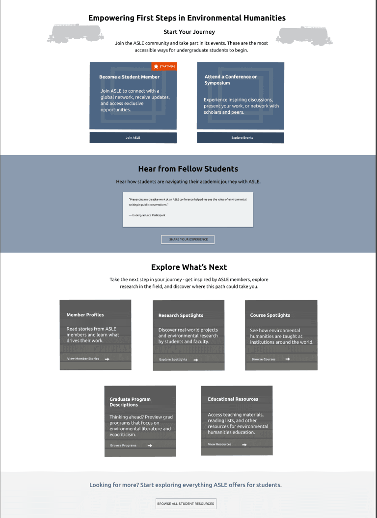
Lacking a Clear Entry Point on the Student Page
The page lacked a clear entry point, making it difficult for new users to understand where to begin.
A primary button "Become a Student Member" was added to create a clear starting point and drive membership engagement from the outset.
💡
Before user test 1
After user test 1


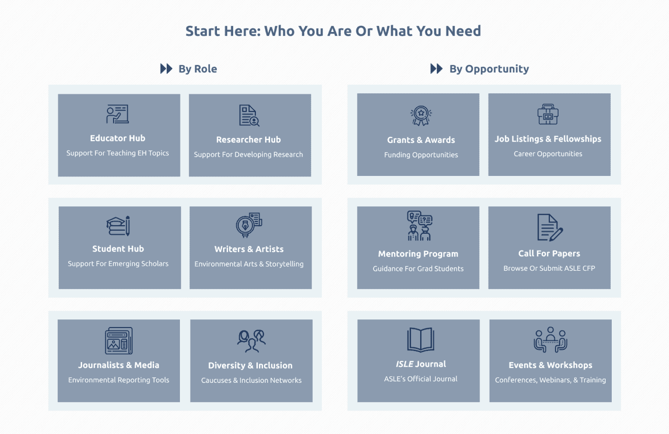
Broadening Access on the Home Page
Before user test 1
Before user test 1
After user test 1
I revised the layout to better reflect ASLE’s full mission. The new structure offers clear access for both academic and creative users, making the homepage
more inclusive.
💡
The early Quick Access section focused only on the Resource Center's core components, which supported academic users but unintentionally excluded ASLE’s broader community.
Mentorship, while important, functions as a programmatic offering targeted at early-career scholars, similar to Jobs and Grants. It remains in the “By Opportunity” section of Quick Access.


User Test (Iteration 2)


Enhancing Discovery Through Structured Navigation on the Resources Page
💡
I repositioned the Tools section between Format and Topic to act as a functional bridge, helping users plan, search, and organize their next steps within the discovery flow.
💡
I introduced a structured Browse by Topic
section, grouping themes into Core, Emerging,
and Regional Focus categories, with a
“View All Topics” option for broader search.
💡
I added a Global Map to the Tools section to help users explore ASLE’s international branches and region-based initiatives more intuitively.
The Tools section felt disconnected from the rest of the layout and lacked clear context for how or when to use them.
Users had no clear way to browse resources by theme, limiting exploratory discovery and making ASLE’s topical depth hard to access.
Before user test 2
After user test 2

Users found the “Programs & Opportunities” section visually dense, with too many equally weighted cards blending informational and action-based content.
💡
I split the grid into two clearer groups, Get Involved for interactive programs and Explore Resources for passive content, to improve scanability and guide user focus.
After user test 2
Before user test 2
Interactive vs. Informational: A Clearer Layout on the Student Page


Underrepresented Leadership on the Graduate Page
💡
We grouped Graduate Student Liaisons and Awards under “Leadership & Recognition” to emphasize ASLE’s commitment to graduate achievement.

After user test 2
Before user test 2
Impacts from User Feedback
Strengthened student engagement
5 out of 6 students felt that clearer separation of undergraduate and graduate resources encouraged them to explore programs and take action.
Improved wayfinding for new users
6 out of 7 users reported that the “Start Here” and role-based navigation helped them find relevant content faster and made the site feel more welcoming.
ASLE users often hold overlapping identities, student, researcher, educator, so the experience needed to support both role-specific pathways and shared resources.
By refining structure and CTA hierarchy, I helped users explore with greater clarity and confidence.
Navigation updates, like placing Tools between Format and Topic
and adding a Global Map, aligned the interface with how users
actually seek opportunities across ASLE’s global network.
Designing for diverse academic roles requires clarity, structure, and intentional entry points.
Project Takeaways
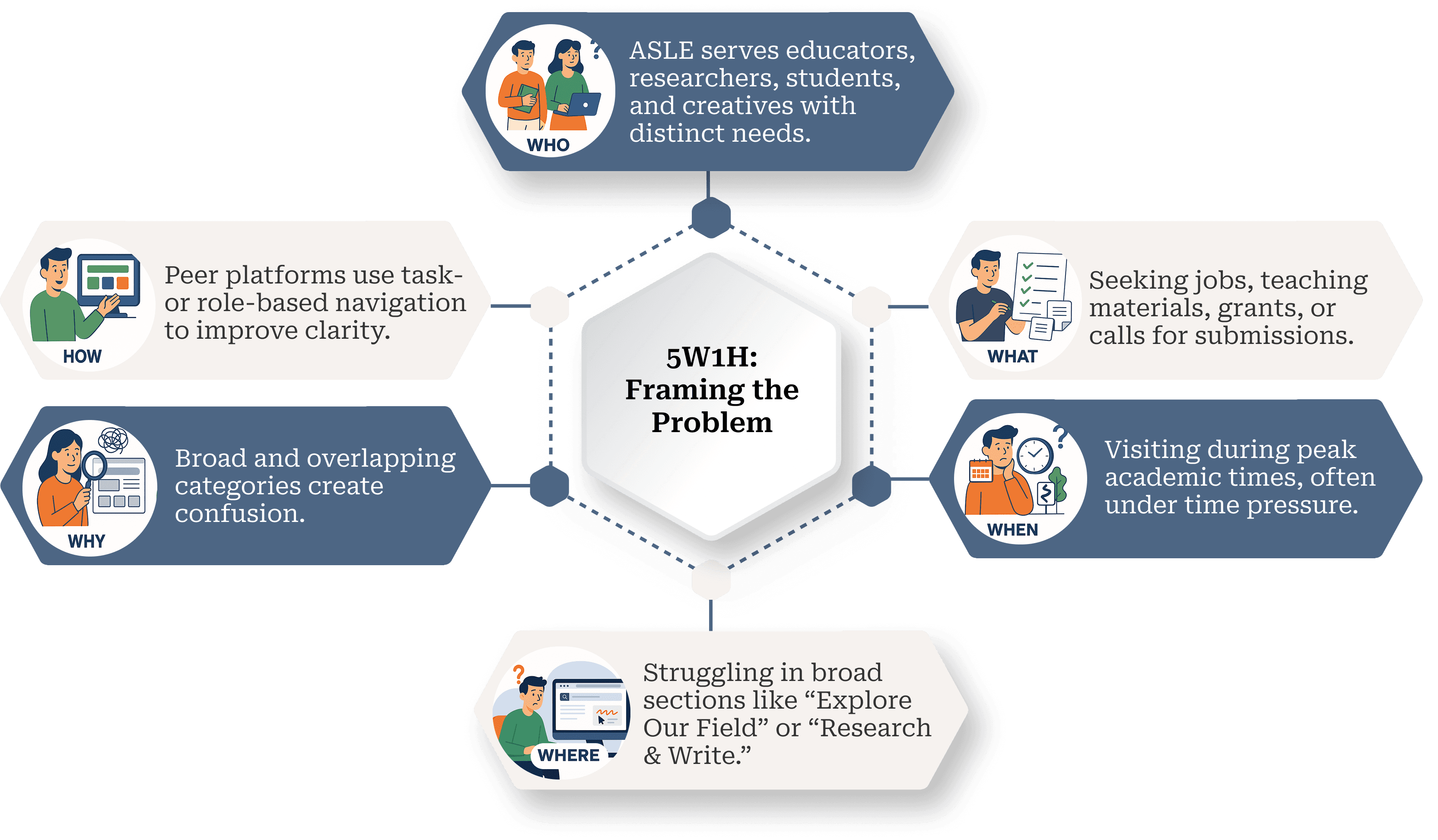
To guide the direction of research and problem framing, We also used the 5W1H framework:
To understand usability challenges in ASLE’s Resources section, we conducted secondary research on academic user behavior, IA, and navigation patterns.
With few public reviews available, we analyzed similar platforms and user feedback to identify common pain points, which helped explain why users may struggle to access key materials and guided the next research phase:
Researching Problem Space
User Goals: Apply for fellowships, find teaching materials, submit work.
Navigation Clarity: Clear, task-based labels and structure improve discovery and ease.
User Types: Lack of segmentation confuses students, educators, and researchers.
Fragmented Content: Scattered resources create friction across unrelated categories.
Methods
Role
5 weeks
UX researcher /
Visual designer
Goals
2 UX/UI designers
Team
Duration
Competitive analysis
User interviews
Persona & Journey mapping
Tree testing
User-Business impact matrix
UI prototyping
Usability testing
Affinity diagram
Improve access to key
resources for students, educators,
and scholars.
Simplify site navigation
by restructuring information
based on user roles.
Increase engagement through
intuitive layout and clearer
content structure.

Before redesign
After redesign
Navigation Structure
Grouping content into five user-driven categories reduces cognitive load, making it easier for all user roles to find what they need without confusion.
📈 Impact
Updated Navigation Bar: Simplified top nav with 5 clear sections: Resources, Community, Scholarship & Publishing, Events, About ASLE.
💡 Solution

Increased confidence in resource discovery
All participants found the reorganized Resources page easier to navigate, describing it as “less overwhelming” and “easier to explore.”
Reseach comleted, we shifted focus to what’s worth solving first.